Day 8 of the 30 Day Writing Challenge
How to Avoid Pitfalls When Creating Custom Illustrations for Clients.
One of the first things I learned after I graduated from college is as a designer you should never become emotionally attached to your designs. It’s a lesson that has served me well during my career. Don’t get me wrong, when a client really likes something I have done, I’m happy and I feel good about my work, but I don’t jump up on my chair and crown myself God of design, or Lord of the Office. On the flip side if a client doesn’t like what I have done, I’m not happy, but I don’t go into the bathroom and cry about it. It’s all part of the business and I accept that. Unfortunately, this principle was recently put to the test when I was assigned to create three custom illustrations for a clients website.
With Great Knowledge Comes Great Responsibility
It seemed like a pretty straight forward project. The client wanted a single page site that would provide information to potential customers. The only thing that was different was he thought it would be cool to have three custom banners rotating rather than photography. Great, I like to do illustrations and stock photography is awful so should be fun. And that’s where I made my first mistake. I didn’t view this as a normal project, so I didn’t follow our normal process for approval.
What I did do?
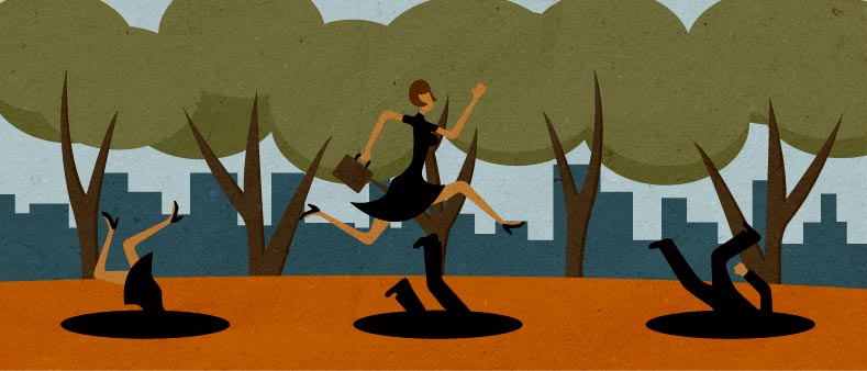
The first thing I did was scour the internet for inspiration. I went through all of my normal design resources, along with some new ones, since this was the first time I was doing illustrations for a client. I found several concepts that I really liked and that I thought would fit well with the tag lines he had provided. I showed the concepts to my creative director and to our senior designer. Both of them were super excited and thought they would be great for this project. The next thing I did was figure out what type of illustration style I would use. Since I can really only illustrate in a couple of different styles, this wasn’t that hard. Once I had those two things figured out, then I developed a color palette that I could use for both the illustrations and the client’s site. Then it was off to the races. I spent the next three days fleshing out my three illustrations. Once I had put the finishing touches on them I submitted them to the project lead who then showed them to client. As far as I was concerned this was a mere formality. Of course the client was going to love them. Just look at these illustrations, who wouldn’t want these on their brand new site.
Well as it goes, it turns out the client did not want these on his site. What I found out, which I should have found out right from the beginning, is the client didn’t like my concepts. He loved the illustration quality and the style, but he wasn’t thrilled about the themes. He felt they were too playful and did not convey the professionalism he wanted his site to have. He especially was not thrilled that their were people in the illustrations, something he had not previously mentioned, but would have come up had I submitted my concepts before actually completing the illustrations. Well, needless to say, I was pretty upset. I had spent a ton of time on these illustrations, and I didn’t agree with his assessment. I didn’t understand how anyone could not like my illustrations, and that’s when I realized that I had broken my rule. I had become emotionally attached to this project and made it about me instead of about my client. I didn’t submit my concepts to him, because it wasn’t about him, it was about me. Once I realized this I immediately calmed down, and set up an appointment to meet with the client.
What I should have done
The client and I met, we discussed in more detail the type of theme he wanted for the illustrations. I pitched ideas and gave him rough sketches right there in the meeting. In talking it out, we decided that he would be best served to have only one banner rather than three. Had we done that in the beginning I would have saved myself at least three full days of illustrating. I had him approve sign off on the concept he liked best and then I did a more detailed drawing that was still a little rough around the edges, but was good enough to give him an idea of what the final piece would look like. Once he signed off on that, I fleshed out the rest of the illustration and sent it off to him for approval. Once he saw the finalized illustration, he approved it and I was able to then design the mockup for his site and the print based mailer that would accompany it. Both the site and the mailer were approved with minimal changes. Here is the illustration the client ended up approving. Of the four illustrations I did, it was my least favorite, but I guess that is the point of this whole story.

What did I learn?
Illustrations are such a personal form of artwork. Every artist has their own style and technique. Because of that I think we forget that when we are working for a client the artwork can’t just speak to us, it has to speak to them as well. If I had just followed the same process that I normally do for a design, I would have saved both myself and my company a ton of time, not to mention I wouldn’t have gotten rainy face over the client rejecting my art.